
Brand Evolution or a Rebrand?

Photo: AFP
Photo: AFP
As I write this article, the Cleveland Indians, an American professional baseball team, has become the second major American team to drop a racist nickname. This follows the Washington Football Team, which was previously known as the Redskins. Cleveland had already phased out logos and imagery of its cartoon mascot, Chief Wahoo, after it was called “no longer appropriate”. Cleveland has gone by “Indians” since 1915, but faced pressure from Native American groups and others to rebrand. They are by no means the last franchise group with a problematic moniker — there’s still the Atlanta Braves and Chicago Blackhawks.
Rebrands, like the ones mentioned above, can be necessary. They are a bit of a gamble for anyone however, especially in today’s world. Even when they’re well-intentioned or have a good reason behind the revamp, you’d always have haters. Many people dislike change, and feel safer with what they’re used to. Change to a well-loved brand can be a shock—one that the brand will have to be prepared for. Further, a full rebrand—which might involve changing anything form the brand mark to the name, colour scheme, typography, image choice and more—can be an expensive process to roll out, depending on the brand. As such, some brands opt instead for a brand evolution or a refresh—more like small tweaks that retain the core look and feel of the brand without a marked change.

Choosing a Brand Evolution or a Full Rebrand

Brand Evolution or a Rebrand?
Considering what’s right for your company? You’d probably be looking at:
  • Budget: Rebrands are expensive
  • Timing: Rebrands will take more time than a brand evolution
  • Stakeholders: What are your stakeholders’ appetite for change?
  • Last update: Is your current branding a year old or 10 years old?
  • Existing brand equity: If your brand has a lot of history behind it, a full rebrand might mean giving all of that up.
  • Reason: Are you updating to modernise the brand (e.g. legibility), for PR (like BP after the oil spill disaster), or because it’s the right thing to do (like Coon cheese, Washington Football Team and more)?
  • Target audience: Are you looking for a new audience, or adapting to a new audience?
  • Business matters: Was there a merger or some other issue that has spurred this consideration?
A rebrand means rebuilding your brand from scratch. Ideally, just about everything would change — not just the logo. Typography, colours, image language, maybe even the brand name. A great rebrand could improve your business (like when Apple shifted to its sleek, white and silver new look), your share of the marketplace, bring new people to your brand, and put you more in line with contemporary competitors. On the downside, a full rebrand could lose you customers, rack up costs in terms of distribution and set-up, or create small PR disasters in itself if not carefully considered.
An evolution, on the other hand, is a small step forward. The risks are lower, but at the same time, the effects are also restricted. A few tweaks here and there might not amount to much. They’re more like refreshing the paintwork on a car—the car still moves the same, quirks and issues and all. Cheaper than a full rework, or a new car, but nothing much changes other than the veneer. Depending on what you need, that might do the trick.

Is this a Brand Evolution or a Revolution?

You might have seen some changes in the works in popular brands that appear to be attempting to toe the line between a rebrand and a brand evolution, such as Burberry and other fashion brands:
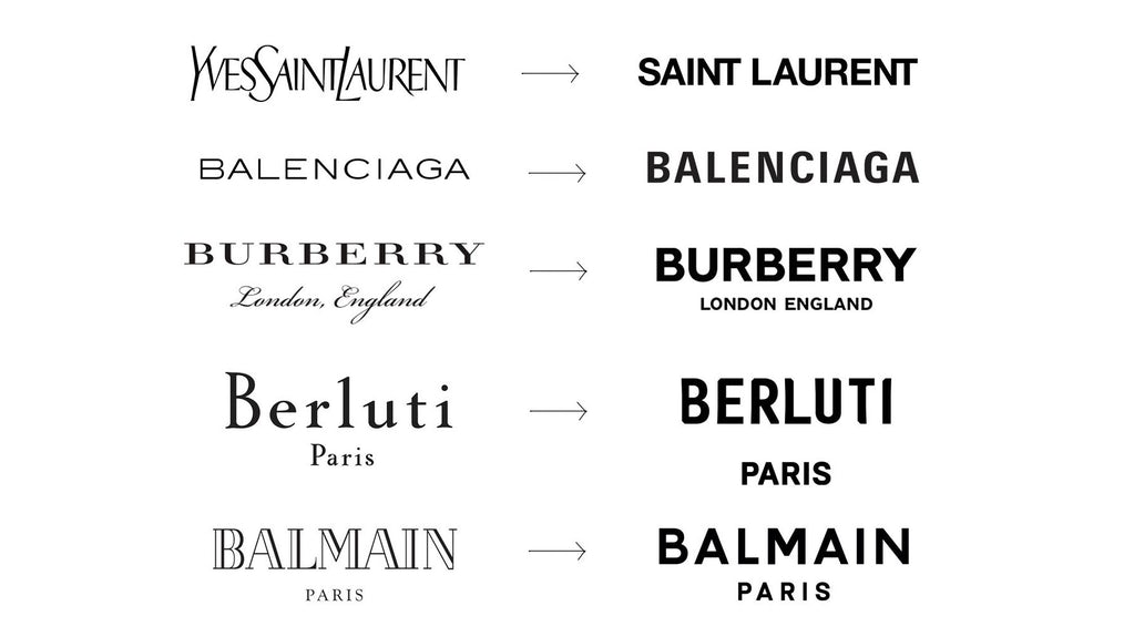
SANSMANIA
Looking at that, you might have thought that the brands decided to just collectively find a sans serif typeface they liked and call it a day. There are trends in branding (including moving to sans serif typefaces), but we don’t recommend following them if you’re looking to make a change. Trends are fleeting. If you follow them, you’d likely have to go through the whole costly exercise all over again in a few years. Not to mention you might end up looking like the rest of the pack.
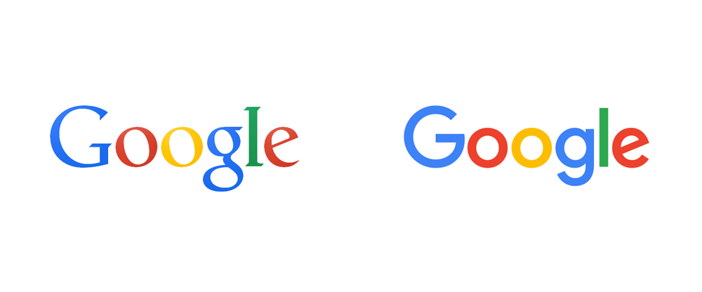
There are good reasons to go sans serif, if created with a strategy in mind and a complete matching brand philosophy and suite:
google_2015_logo

Hard to remember that the wonky serif used to be what Google looked like compared to the slick brand suite it has now, which it’s still rolling out across its other offerings like Gmail and Drive. Not everyone was onboard with the rebrand, nor has everyone been onboard with the new icons:
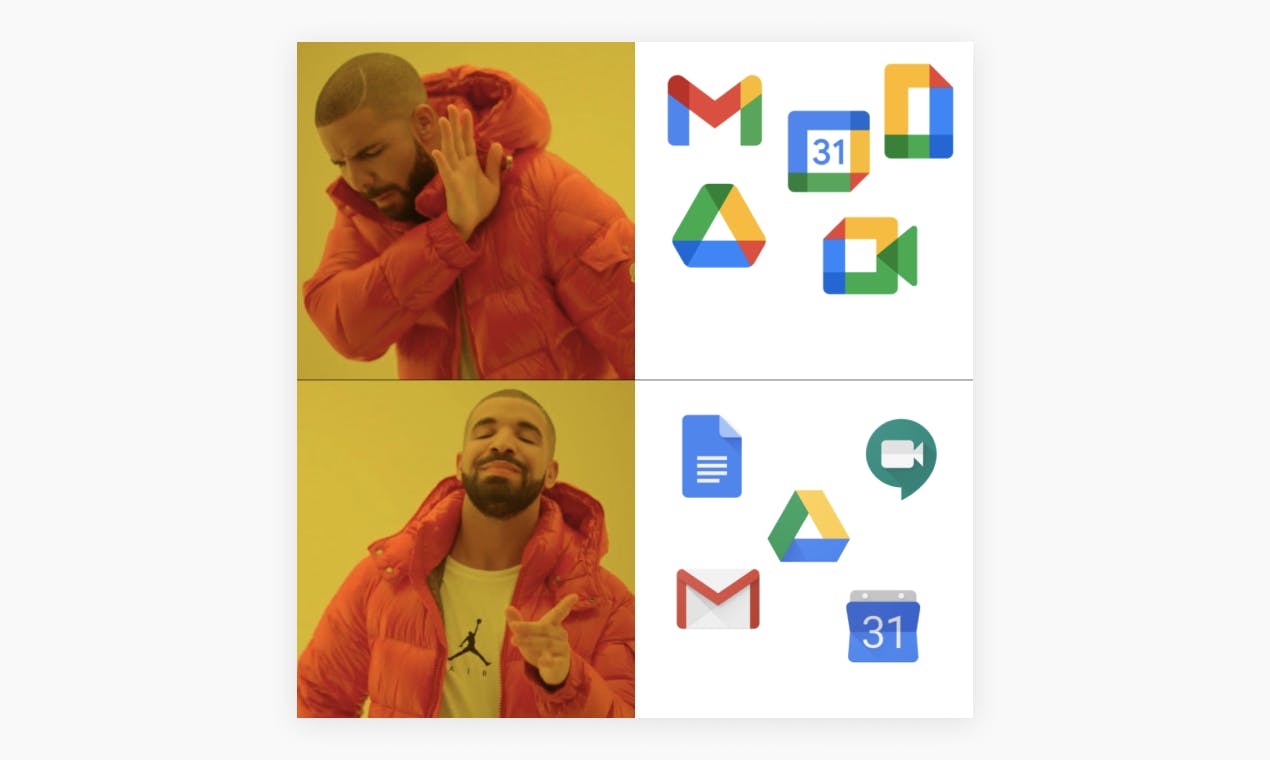
1c7ce892-771a-4751-a912-5ece8a4a4df1

Still, given time, people will get used to it, and the design philosophy behind the change — to reinforce the brand by making the designs look like they belong in the same family — will likely stick. Google emerges with a stronger brand presence, one that’s more legible across the new digital age.
In Short

Still unsure what you might need? We’re here to help. You can also check out the branding work we’ve done with [ Scope ] and the evolution work that we’ve done with [ Musq ].

Scroll to Top